









































In the hyper-competitive world of digital marketing in Dubai and the United Arab Emirates, simply having a brand presence is no longer enough. What matters is how your brand is felt, and how it communicates without a single word. This is precisely where the power of color psychology comes in: far more than an aesthetic choice, it's a fundamental strategic tool for shaping how your brand is perceived in the mind of your target audience. A savvy digital marketing manager knows that colors speak a universal language of emotion, capable of guiding perception, driving behavior, and building a memorable connection.
1. The Language of Color: Decoding Emotional Messages for Your Brand
Every color carries a set of deep meanings and psychological effects that often transcend cultures, playing a crucial role in how your brand is perceived. Understanding this silent language lets you communicate your message more effectively and build a strong, consistent visual identity.
-
Red: Passion, Energy, Urgency. This color powerfully grabs attention, signaling excitement, love, or a need for immediate action. It's often used for energizing products or in promotions requiring a quick response. For sports or fast-food brands, red can stimulate appetite or enthusiasm.
-
Blue: Trust, Stability, Serenity. It symbolizes reliability, security, and credibility. It's an excellent choice for brands in finance, technology, or healthcare, looking to inspire a sense of trust and professionalism. Blue is reassuring and often associated with logic.
-
Green: Growth, Renewal, Health. Linked to nature, harmony, prosperity, and sustainability. Ideal for brands in environmental, health, and wellness sectors, or any industry focused on growth and innovation. It also evokes calm and balance.
-
Yellow: Optimism, Joy, Creativity. The color of sunshine and positive energy. It reflects happiness, friendship, and innovation. It can be used to make a brand feel more friendly and approachable, sparking a sense of joy. Yellow is often associated with attention and light.
-
Black: Luxury, Refinement, Power. It conveys a sense of elegance, exclusivity, and authority. Widely used by luxury brands aiming to project a premium, high-quality image. Black is timeless and sophisticated.
-
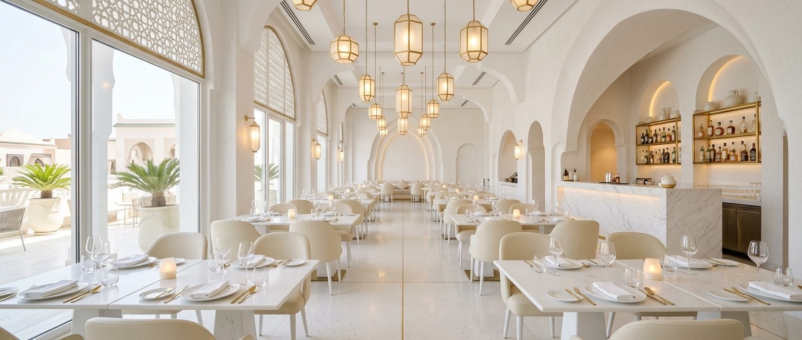
White: Purity, Simplicity, Clarity. It symbolizes cleanliness, innocence, and clarity. Often used to create a sense of space or to showcase other colors in the design. It conveys a message of minimalism and perfection.
-
Purple: Royalty, Mystery, Creativity. Combining the calm of blue and the energy of red, it's associated with luxury, wisdom, and spirituality. It can reflect a creative, high-end, or artistic brand, suggesting imagination and ambition.
2. Beyond the Basics: Adapting Colors to Cultural and Industry Context
While colors carry universal meanings, it's crucial for digital marketing managers in Dubai to understand that cultural context and industry trends can change those meanings. What's perceived positively in one culture can carry completely different connotations in another.
-
Cultural specifics: In a region like the United Arab Emirates, certain colors carry strong cultural and religious connotations. For example, green is often associated with Islam and prosperity, while white can carry different meanings depending on context (e.g., purity, but also mourning in some cultures). Thorough research is essential to ensure your color choices resonate positively with the local audience and avoid any cultural misinterpretation.
-
Industry trends: Certain industries have traditional color palettes that consumers expect to see. The financial sector often leans toward blue to inspire trust, while environmental companies use green to emphasize sustainability. Your brand can choose to follow these trends to build familiarity, or deliberately break them to stand out, but this decision should be carefully considered and based on a clear marketing goal.
-
Competitive analysis: Observing the colors used by your competitors in Dubai and the region can give you a sense of the current visual landscape. You can choose to stand out with a unique color palette, or align with dominant colors if they reinforce the message you want to convey. The goal is to build a distinctive, effective visual identity that positions you favorably in the market.
3. Practical Application: Building a Consistent Color Identity for Your Brand
After understanding color psychology and its context, it's time to apply this knowledge systematically and consistently across every brand touchpoint. Consistency is the key to anchoring your color message in your audience's mind.
-
Developing a primary and secondary color palette: Don't settle for a single color. Choose a primary color that reflects your brand's essence, then add one or two secondary colors that complement it, plus an accent color for elements that need special attention (like call-to-action buttons). This complete palette ensures diversity while maintaining visual consistency.
-
Consistent use across all channels: Your color palette should be applied consistently across every digital and non-digital channel. From your website and digital marketing campaigns to your social media profiles and packaging, visual harmony must be maintained. This strengthens brand recognition and the message you're trying to convey, creating a unified experience for the consumer.
-
Continuous testing and optimization: Color psychology isn't an exact science; reactions can vary based on multiple factors. Don't hesitate to run A/B tests on the colors used in your digital campaigns (for example, the colors of purchase buttons or headlines) and analyze the data to determine which colors generate the best response from your audience. This lets you constantly optimize your strategy for maximum effectiveness and maximize your return on investment.
In short, colors are far more than a simple aesthetic touch; they're powerful tools that tell your brand's story and influence how people perceive it and interact with it. Carefully harnessing the power of color psychology gives your brand a strong visual voice in the competitive market of Dubai and the United Arab Emirates.
To build a strong, consistent visual identity that harnesses the power of color psychology in Dubai, you need experts who combine creativity with a deep understanding of digital marketing. Our visual identity creation company in Dubai is your partner in building an impactful brand. To strengthen your marketing strategy in Dubai and offer comprehensive solutions, our visual identity creation company in the United Arab Emirates is the optimal choice. Whether you're looking for a marketing agency in the United Arab Emirates to boost your digital presence or develop a unique visual identity, we bring you the expertise you need to succeed.


